brevitē
eCommerce checkout workflow redesign


About
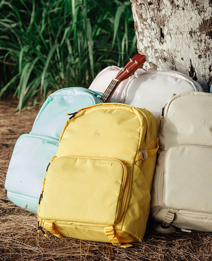
The Most Exciting Backpack Brand

Brevitē is a award-winning direct-to-consumer brand that uses backpacks to elevate the user journey.
For three years, as Product Design Manager, I led the company's design efforts, overseeing both digital and hardware projects.


Mission
Elevating the Brevitē experience by creating a seamless, user-centric website.
Identifying The Pain Points
Research
Key finding 1
Confusing and hard-to-use add-to-cart UX
The add-to-cart experience caused confusion and frustration, leading to abandoned purchases.
Key finding 2
Unoptimized navigation experience for shoppers
Navigation system is inefficient, causing frustration for shoppers and negatively impacting their overall experience.
Key finding 3
Leakage of customers to other e-commerce sites
Poor add-to-cart experience drive customers away.
Data from
35%
Increase in abandoned cart rate over the past quarter.
18%
Increase in average session duration with no corresponding increase in purchases.
5%
Drop in Customer retention rate.
Business goals
Enhance brand perception
Elevating the Brevitē brand through a visually appealing and intuitive website.

Increase user engagement
Encouraging longer browsing and higher interaction rates.

Boost conversion rates
Streamlining the purchase process to increase sales.
Key Themes When Designing
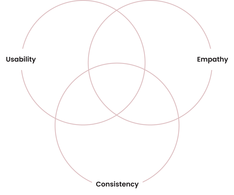
Usability - ensure the website’s user interface is intuitive and efficient, allowing visitors to navigate and complete their tasks with minimal effort.
Empathy - prioritize understanding and addressing the diverse needs andemotions of the users.
Consistency - maintain consistency in design elements and interactions across the website.
Applying the UX Themes in the New Website Design
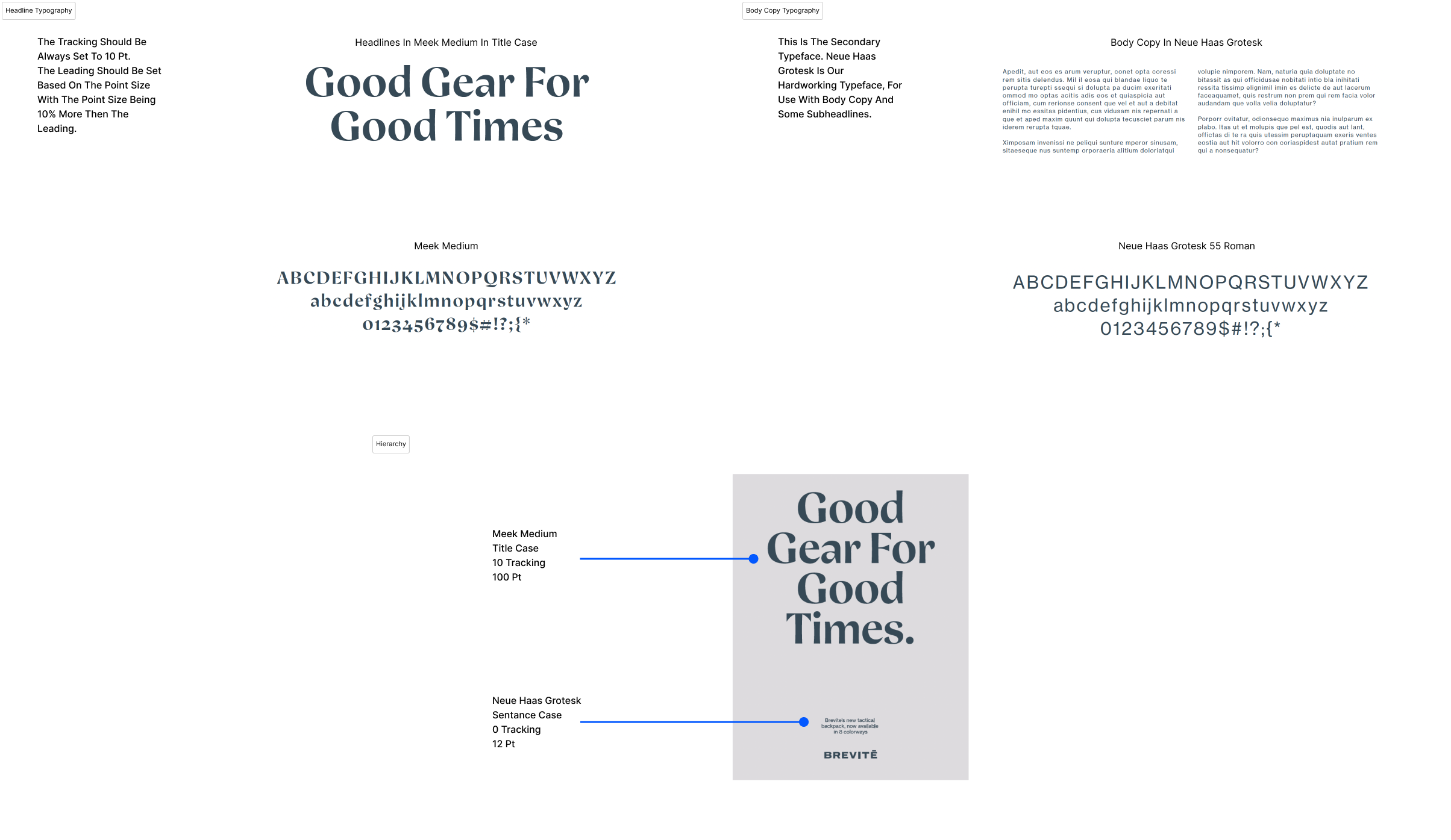
Consistency through organized branding guide
The branding guide ensured consistent visual and written communications by providing clear guidelines on topics like typography usage, color schemes, grid layout.
This uniformity strengthened the brand recognition, built audience trust, and simplified the design process.
Typography
Colors
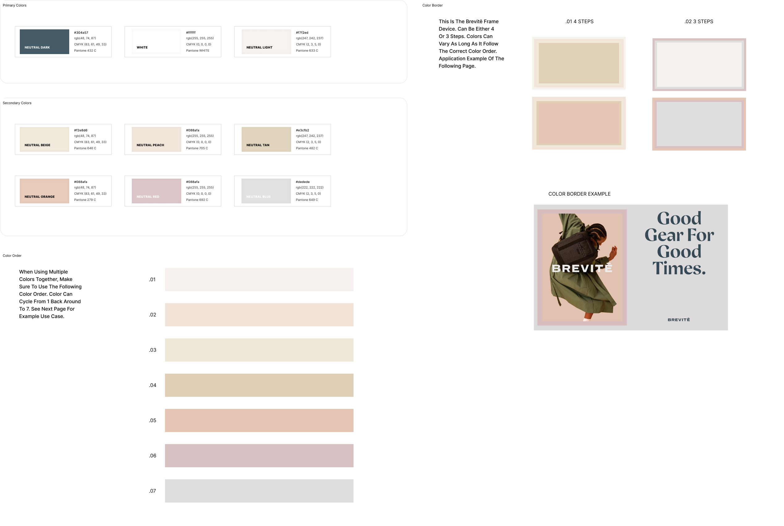
Grid Usage

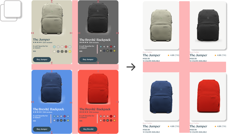
Improve usability by reducing clutter (Card UI)
The reduction of clutter throughout the website, like shown here in the Card UI, meant to create a cleaner, more focused design, making it easier for users to find and interact with different components and key information.
We wanted to eliminate unnecessary elements, so users can navigate the website more intuitively, leading to a more efficient and enjoyable experience.

Prioritizing empathy to enhance the user journey
The user flow was carefully designed to simplify and enhance the shopping experience.
Empathizing with users’ needs allowed us to create clear, intuitive navigation paths, letting users to easily filter categories and collections, view product details, and make purchasing decisions.
Old

New

Final design
Homepage
A clean, visually striking layout with high-quality imagery and clear navigation. Focuses on simplicity, with a prominent value proposition and easy navigation to various sections of the site.
Category Page
The design reduces clutter by organizing products into clean, easily navigable sections, enhancing the browsing experience.
Product Page
Showcases products with detailed images, descriptions, and reviews, emphasizing ease of purchase.
Cart Page
The cart page is streamlined and encourages cross-selling with related product suggestions to boost revenue.
Impact
0%
Sales conversation rate
0%
Buying time
x0
YoY revenue growth
Project Takeaways

Improving early collaboration
Prioritizing early collaboration with engineering to ensure a comprehensive understanding of both frontend and backend requirements would be immensely important.
This would help identify edge cases sooner and streamline the development of innovative features.

Emphasizing mentorship and soft skills
I would keep on actively seeking mentorship and feedback from the start, recognizing the importance of soft skills in addition to technical abilities.
Being proactive in initiating conversations, updating stakeholders regularly, and seeking guidance to navigate potential roadblocks.